This article was written for the individual assignment of DV2008 Interface Design, 2020 Semester 2
Mobile user interfaces are relatively smaller than websites, with more emphasis on functionality. However, users are more likely to notice the interface design of an app when they first start using it. Navigation of screens are influenced by many factors including the look and feel of an app, so visual design is just as important as the interaction design, functionality or user experience.
As a complete newbie in this field, this module introduced me to the many visual elements of user interface design, particularly for mobile devices. Creating the screens for the mobile app was no easy feat, but through this process, I’ve taken away a few aspects of UI visual designing for mobile devices.
This article will explore the visual elements of mobile app designing, meaning what is seen on the static screen and the user’s first impression of it. It will not discuss interaction design or information architecture — that will be relevant for another article.
Colours

When thinking about visual design, colours are one of the most important factors to consider. The colour palette determines the mood of the app — whether the colour scheme is monochromatic, analogous or complementary, it can evoke different emotions from users to help in navigation and user experience. These colours differentiate app functions, helping to create emphasis or depth to app elements, such as buttons and headers, that will be explained below.
In the group assignment, to help in the critical step of picking out the right colour palette for the app, I used Coolors, a site that generates palettes from thousands of colour schemes.
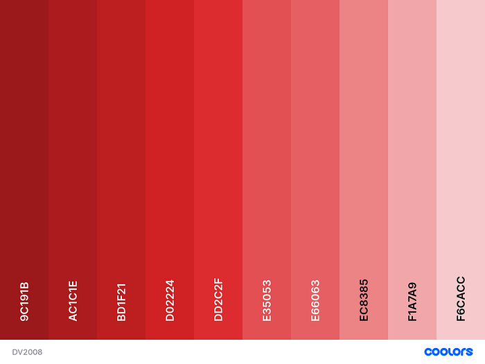
Monochromatic: Uses one base colour, with shade and tint variations of the same hue
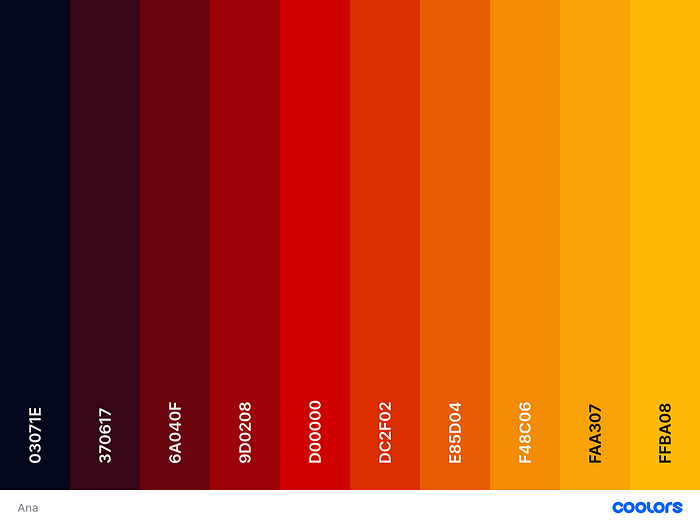
Analogous: Involves adjacent colours on the colour wheel
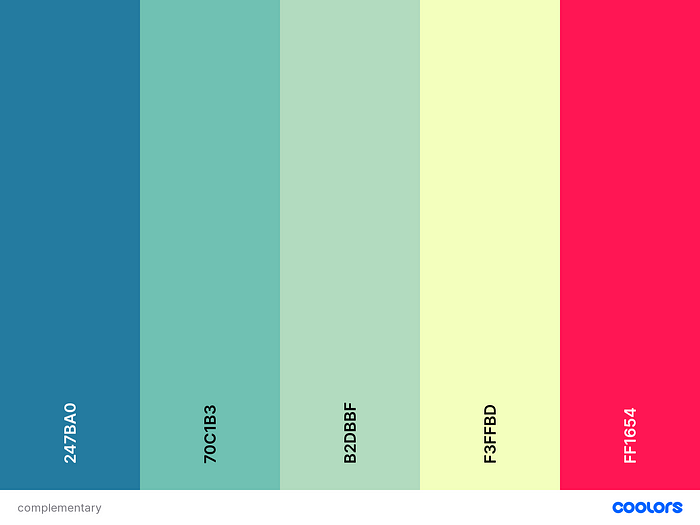
Complementary: Involves opposite colours on the colour wheel
Colour psychology is the study of colours as a determinant of human behaviour. Certain hues influence perceptions or evoke emotions from people. For example, yellow and red are associated with fast food (McDonald’s, KFC, Carl’s Jr.), while green is more commonly associated with healthy food (Whole Foods).
Another local example is Greendot, the largest vegetarian restaurant chain in Singapore. They serve mostly healthy meat-free food, and the colour they associate with is r̶e̶d̶, just kidding, green.

Colour is all around us, yet not many people will immediately connect colour with emotion or thinking. In this project, my group and I used red and yellow for our food delivery app. Yellow and orange typically make people hungry, and red is a passionate colour. However, it is notable that colour is subjective to the viewer, and while red might come off as energetic to some people, it is also seen as angry and jarring to others.
Mobile App Colour Trends
Colour gradients are colour transitions from one colour to another. They create more colour tones when the two colours (or more) blend. Usually, these gradients are used with monochromatic or analogous colours. One example of a mobile app is Instagram, changing its logo to a brighter gradient.

In the group project, instead of a standard red, yellow or orange solid colour, we opted for a vibrant colour gradient similar to Instagram. This led to another point in colour visual design in mobile apps: the difference in screen colours.

In Figma, the colours were seen in sRGB, a standard RGB (red, green, blue) colour space that HP and Microsoft created cooperatively in 1996 to use on monitors, printers, and the Web. RGB and HEX are typically used for onscreen designing, while CMYK (cyan, magenta, yellow, black) is used for print. Figma’s use of sRGB gives more consistent and brighter colours than the image that is saved in Adobe RGB, which squeezes colours into a smaller range and makes it duller. This became an issue in the user testing stage when respondents pointed out the brighter colour as a problem. To cope with that, not only have we reduced the intensity of the colour gradient by desaturating it, we introduced dark mode to reduce the brightness of the white screen with the colours.
Dark mode is the appearance of screens when systems adopt a darker colour palette for all windows, views, menus, and controls. In mobile devices, iOS and Android both offer the option to turn dark mode on easily. As a result, many mobile app developers have also developed the option to use the app in both modes.

Going back to the theory on colour psychology, the darker colour scheme might appear dull or uninviting to some users. Food applications usually stray away from dark mode — it is difficult to think of one that has this feature from the top of my head. It might be because of the implication that it will not excite the user or make them “hungry” to use the app, but for our project, we toyed with the Dark mode option because of the way the dark tones contrasted with the vibrancy of our colour gradient.
Typography
In mobile app visual designing, typography refers to the font, spacing, size, alignment and once again, colour of the text in the app. It is most important that the user can read all texts in the headings, subheadings, titles and even the fine print in the terms and conditions. Legibility is the ease with which a reader can decode symbols and letters. Readability is the arrangement of fonts and words in order to make written content flow in a simple, easy to read manner. In mobile apps, both legibility and readability must be considered for the user to understand the functions of the app. In this section, I will discuss legibility and its role in visual design.
Choice of Font
There are four types of commonly used fonts: Serif, Sans Serif, Script and Decorative. To enhance legibility in mobile devices, Script and Decorative are seldom used. The designer has to take into account that the phone screen is much smaller than other screens, and apps seldom utilise the zoom feature for static screens. A bad font choice results in poor legibility and the visual design has failed.
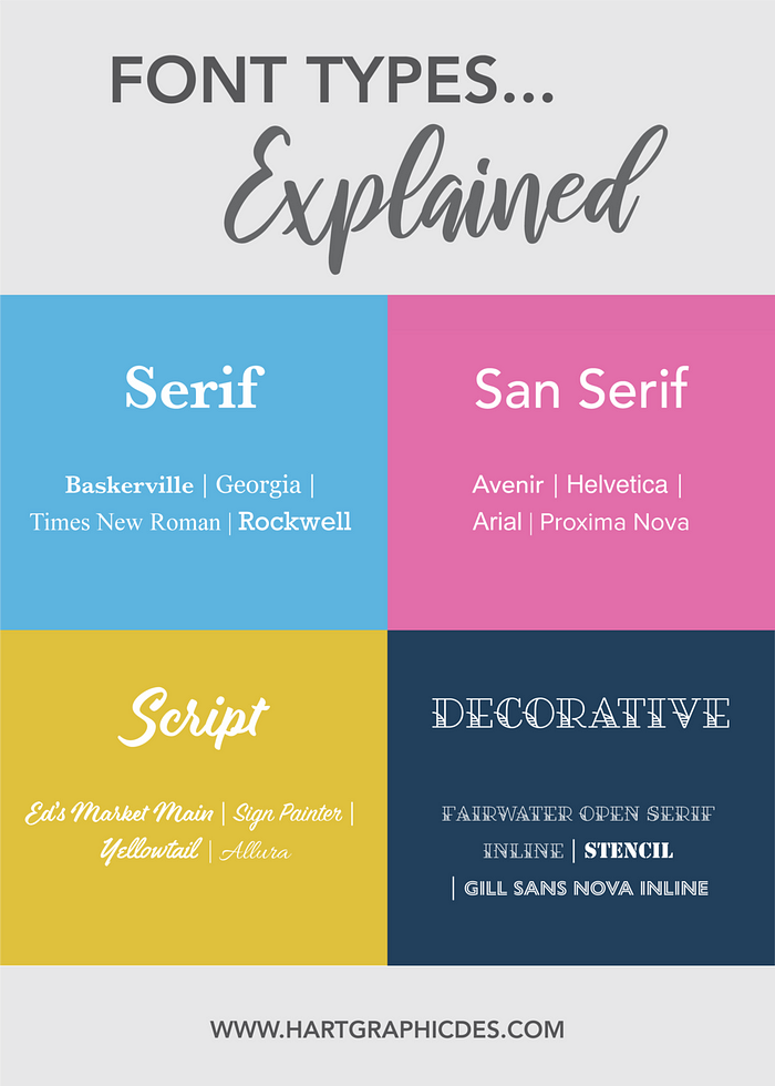
Fonts also set the tone of a mobile app. Serif is considered more traditional and formal, so it is often used in official apps. It also appears trustworthy and reliable, so one will expect to see it in professional businesses or corporations, or more notably, in student essays and reports.
However, more mobile apps use Sans Serif because it does not clash as much with the other visual design elements. The idea of a mobile app is an alternative, convenient platform to use on the go, so the tone is usually more casual than formal websites or reports. Sans Serif sets a more relaxed tone while staying legible for users to read at ease.
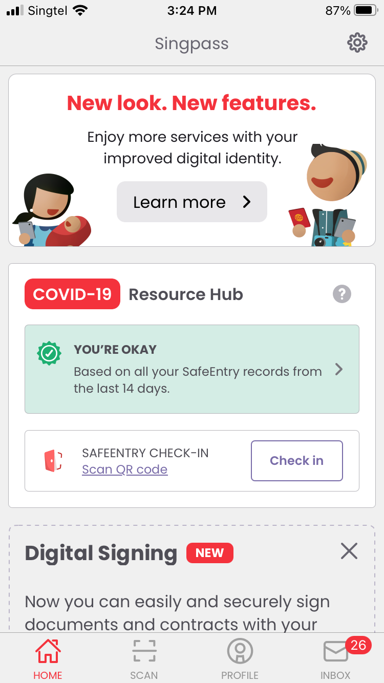
For example, below are two different apps. On the left, Singpass is a Singapore government app for citizens to access information from government sources in one place. The app recently updated to a more casual Sans Serif font. Although the app is an official platform for locals, the tone is less formal because it hopes to attract more users. On the other hand, The Straits Times is a local newspaper and the mobile app version uses a Serif font. As a newspaper, it aims to report reliable news and as explained, the Serif font will help users visualise the importance of any breaking news.

Font Size
Mobile devices are designed to be small enough to fit in one’s hand easily (though these days, they seem to be getting bigger). This means that the visual designer has to take sizing into account, including other factors such as screen glare and lighting, to design an app with good legibility.
Both Google and Apple have guidelines to guide mobile UI designers in choosing the correct size of a font. The font cannot be too small otherwise older users might find it troublesome to read, and it also cannot be too big to take up too much space that could be used by images, icons and buttons. Apple’s human interface guidelines recommend body text to be 17pt (1/72 of an inch, with respect to the physical screen size) as the minimum size, while Google’s material design guidelines recommend 14sp — 16sp (Scale Independent Pixel). Another important point to take note of is Apple’s use of pt for font sizes and Google’s use of sp.
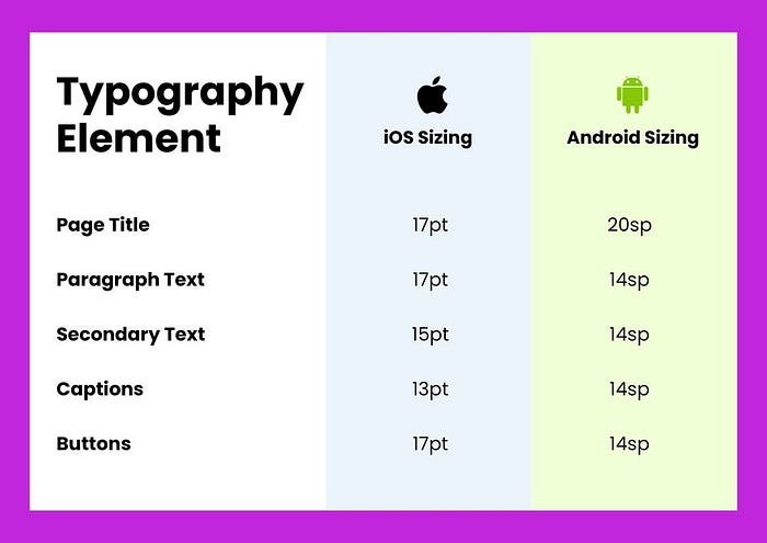
The size of the font also depends on whether the text is a title/heading, paragraph/body, secondary, caption or within elements such as buttons and search bars. Headers are larger in size to attract the user’s attention first before they continue to read on, but they should not be too large that it takes up the entire screen. Likewise, the body text should not be larger than the main title, and it should not be too small to the point of illegibility.
Buttons
Buttons are interactive elements that have help in user navigation and improve the overall experience of an app. Here, I will discuss the importance of the visual design of buttons. Designers have to increase the attractiveness of buttons so that users will be inclined to press it for a particular function. Likewise, they have to consider the visual design of inactive buttons, such as ones that have already been pressed and are no longer in use.
Shape and Size
Most buttons are rectangular, but recently there is a trend of rounded buttons in all shapes and sizes, including circles. As mobile users become more familiar with the styling of rectangle buttons, visual designers can play around with other shapes, as long as the design fits well with the overall theme of the app. While the size ensures that users can interact with a button relative to their fingers, a bigger button relative to the text can be off-putting, and one that is too small will be missed entirely.

Colours and Shadows
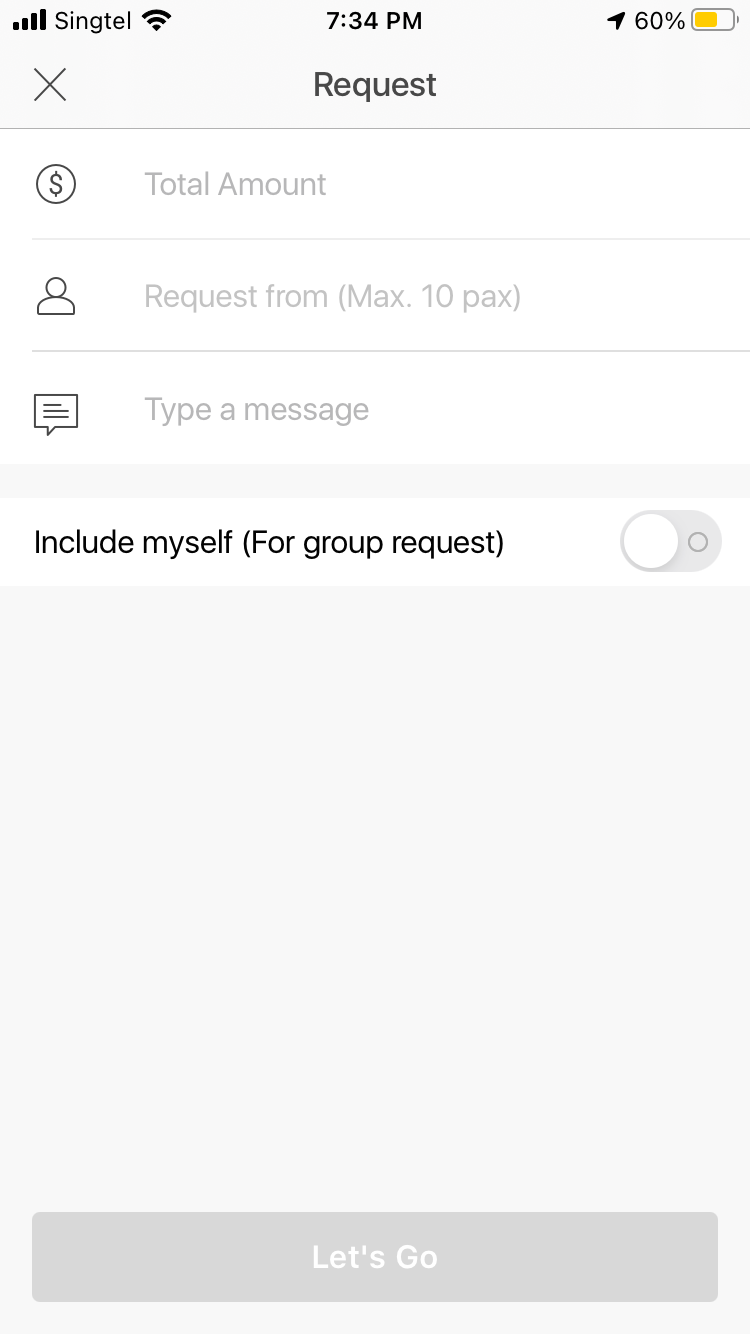
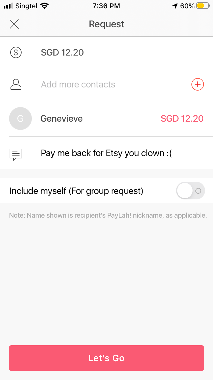
Sometimes, the designer will have to consider the visual design of buttons to emphasise actions that they want the user to take. Without going too much into the details in interface design or user navigation, colours and shadows are important for better visualisation. For example, in the DBS Paylah! feature, which allows the user to request money from another contact, the button at the bottom is seen as a dull grey if none of the required fields is filled. After keying in my options, I am able to see that the button has magically changed colour. The button went from “non-clickable” to “clickable” without instructions from the app, yet the user is able to understand the process.
Layout
The limited size of a mobile screen will challenge the designer into planning the best layout that showcases important functions. They have to consider the media (images, videos, icons), text and other elements like buttons and navigation bars.
Consistency
The layout also has to be consistent throughout the app, meaning the screens should have the same theme (font, buttons, media) that comes together coherently. For example, Grab does a good job in bringing together all the different services that they offer. Below is the mart and food delivery service, both with similar screens for different features. It is clear that they are the same app and the layout is consistent: search bar on the top, similar icons used, coherent font sizing. It could be better improved if they placed the menu options (seen in the white card) on the same level, but this difference might have been deliberate to guide the user through their navigation process.


Hierarchy of Content
With the comment on the menu options for Grab, another important issue to consider for the app layout is the need for a hierarchy. Some features are just more important than others and visual design allows the best features to stand out. In the Grab example, the search option is the first from the top because users can easily see it first when they view the screen. This visualisation is combined with the interaction design and information architecture of the app for the best user interface and user experience.
Combining Everything Together
Visual design is not just about one element, it requires the collaboration of the colour, font and layout — zooming into the shapes and sizes of all these elements. An attractive mobile app considers all these elements to make it both aesthetically pleasing and practical for the user.
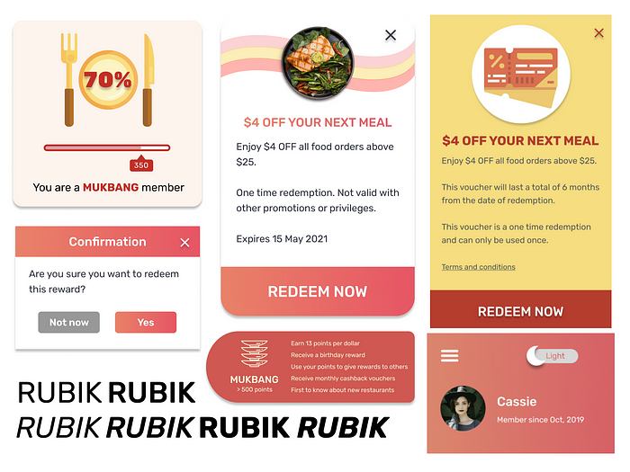
These details were taken into consideration with the final assignment of the group project, particularly in the designing stage. I wanted to connect the light mode with the dark mode so that more colours could be explored, but at the same time play with the different shapes and rounded corners. Monochromatic and analogous colours were used in shades of red, orange and yellow and their hues (including pink and orange gradients). The end result was something better than what would have been done without researching for visual design guidelines for mobile apps.
